Letters From Home: Behind the Scenes 1
May 05, 2020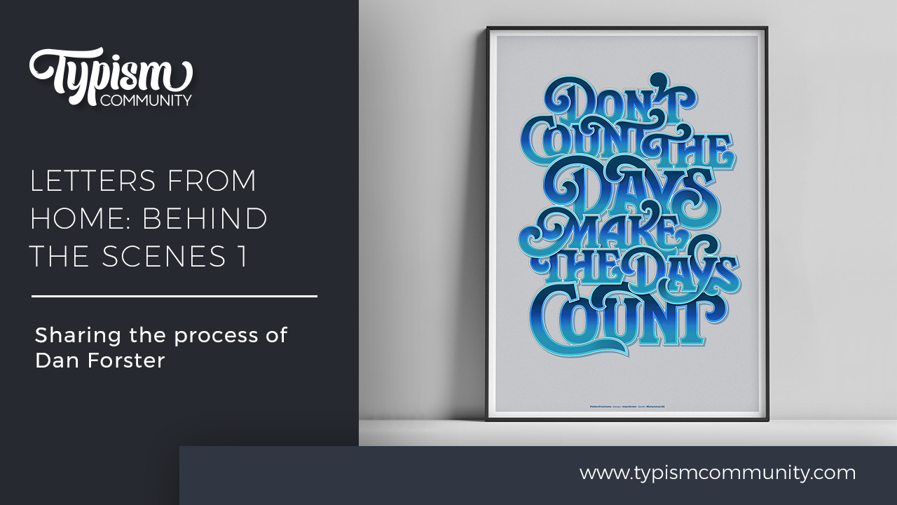
We're thrilled by the response of our Letters From Home project. It's amazing to see so many people around the world creating artworks to help inspire us to stay positive during this incredibly stressful time.
We have truly loved seeing and sharing your work, and have decided to start a behind the scenes series of some of our favourites.
First up is this wonderful work by Dan Forster. The quote is by Muhammad Ali, chosen as a sentiment for our current situation. Dan has given us an in-depth look into this complicated piece. Thanks so much, Dan for participating in our Letters From Home project and for sharing your process.

My first super-quick sketch in Procreate to assess the letterforms widths. My initial thought was to create consistent line widths that were neatly stacked. However, this looked pretty boring due to the repetition of some of the words.

Alternative sketches attempting to create a more interesting, staggered composition that ‘nestled’ the letterforms together.

After lots of tweaking and redrawing the letterforms I arrived at the final sketch in Procreate. Further adjustments to the composition would be needed, but this would now be easier and quicker once in Illustrator.

However, I couldn’t resist trying out some further possibilities – swashes, terminals and in particular alternate ‘E’s. Most of which were dismissed.

I knew I wanted the type to have an inline and a drop shadow. So again these were quickly tested out in Procreate on just a couple of characters. This was enough to give me confidence it would work.

The next step was to move onto the vector drawing. The final Procreate sketch was placed into Illustrator with the opacity reduced. Then I began vectoring the characters.

I wanted to ensure consistency with the letterforms so once I had a few basic letter shapes drawn, I moved these away from the sketch and focused on drawing the letters in isolation. Also I knew the inline shapes needed to be determined early on, so these were included too.

Several alternate characters were created to test different options within the composition.

Illustrator’s ‘offset path’ feature was useful in creating the line shapes, but it highlighted (and also caused) a number of issues (with both the inner and outer shapes). These were then redrawn manually to balance up the weights and remove kinks.

Various options for the ligatures and overlapping shapes.

Initial vector composition. It's getting there but lacking depth. So...

Next, I experimented with adding a further outer shape (white), plus key-lines and a drop shadow. I also had a quick play with colour and gradients to add further depth.

The final designs had four layers to each character – constructed as shown here. The two top layers are gradients, with the top layer's opacity set to 'Multiply'.

The many steps to reach the final composition. The final design in two colour options.


Stay connected with news and updates!
Join our mailing list for the latest updates about Typism Summits, Books, Membership News, and the Latest Lettering Challenges.
We hate SPAM. We will never sell your information, for any reason.