Flashback Series: Stop-Motion Animation
Jul 01, 2020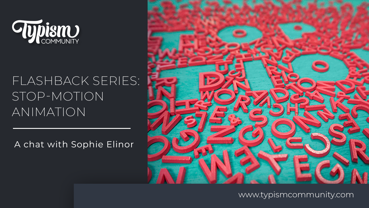
We recently took a trip on the Way Back Machine to locate some of our blog posts from the archive. Man what a trip! So many great things happened on the old *hacked* Typism website that we want to share them with you again in our Flashback series!
Back in 2017, we chatted with Sophie Elinor about the gorgeous little stop-motion animation she created to help explain the difference between hand lettering, type design, illustrative lettering, and animation.

Sophie is an Australian typographer and graphic designer. As a self-confessed type dork, she feels that typography is the place where language meets design, and where the written word is brought to life.
Keep reading to see how far Sophie's love for type goes!
Typography can be a difficult thing to explain to people who aren’t themselves super into it. I’m a big ol’ type dork, but when I speak to people less chronically nerdy than I, often I inadvertently reduce typography to, “Oh, you know, fonts and stuff…”.

That just kills the hopeless romantic in me, who wants to shout from the rooftops about the many reasons I love typography: it’s that sweet spot between language and design; it’s showing AND telling; it has so many moods and manifestations… (Can you tell I studied visual arts at school? I speak fluent art wank).
It’s an area that is both incredibly niche, and infinitely broad. Layout, hierarchy, calligraphy, logotypes, wayfinding; and typography is baked into so many layers of design. I love eliminating all the other ingredients and restricting my palette to the alphabet; obsessing over the different mediums in which I can bring the written word to life.


But it’s hard to slip all of that sentiment into a casual conversation. At least, not without sounding like someone in dire need of a pantsing. So I made a short video that tries to articulate everything in a more accessible way. It’s an attempt to show how multidimensional typography can be, and the areas in which I dabble.
Stop motion is such a playful way to liven up letters. The end result oozes energy, but the process requires a buttload of stamina. Contrast that to the loose, free and expressive nature of hand lettering; so full of imperfections.

Type design is a completely different beast. It’s an entire communication system, and every single character (and each space around it) has to relate to the others. It must be uniform and legible. Cohesive.
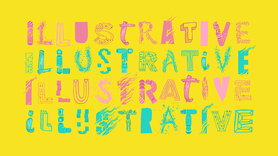
Illustrative lettering has fast become one of my favourite pastimes. It‘s experimental—blurring the relationship between readability and illustration. Blending those interpretive letterforms with animation can inject so much verve and personality.

Next time someone asks what I do, I think I’ll just show them this video…
Stay connected with news and updates!
Join our mailing list for the latest updates about Typism Summits, Books, Membership News, and the Latest Lettering Challenges.
We hate SPAM. We will never sell your information, for any reason.