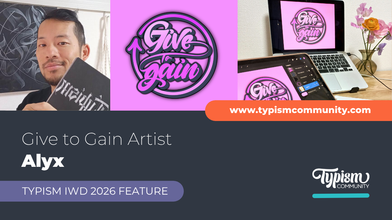
Flashback Series: Bilingual Lettering
May 26, 2020
We recently took a trip on the Way Back Machine to locate some of our blog posts from the archive. Man what a trip! So many great things happened on the old *hacked* Typism website that we want to share them with you again in our Flashback series!
Back in September 2017 we brought you a story about “Bilingual Lettering.” This is a series of Latin-Kanji pairing studies—for use in lettering and logotypes—by New-York-based designer, TienMin Liao.
TienMin Liao studied typeface design at The Cooper Union and worked on various logotype development and refinement projects, from consumer brands to global organization at Siegel+Gale in New York.

Born and raised in Taiwan, TienMin grew up in a multicultural environment where people use not only Mandarin and Taiwanese in their daily life, but also mix with lots of vocabulary from other languages, such as English and Japanese. With this multicultural background, TienMin, as a brand designer and typographer, noticed that lots of the Latin-Kanji (Hanzi/Chinese character) bilingual logotypes don’t express the same personality, and the disconnection between two languages is usually caused by a lack of typographic knowledge as well as branding sensibility.
In order to find a systematic method to inject the same “personality” and bring in the same “look and feel” into the two scripts, she started her Bilingual Lettering project in 2016 in hopes of refining her own technique and being a resource for others doing the same.


The project site documents a library of 50+ bilingual lettering pairing study as well as her essay on research, process and synthesis from a branding standpoint. The essay analyses the different structure between Latin and Kanji, introduces a systematic approach to create bilingual lettering, also discusses alternative solutions to improve the letterings.

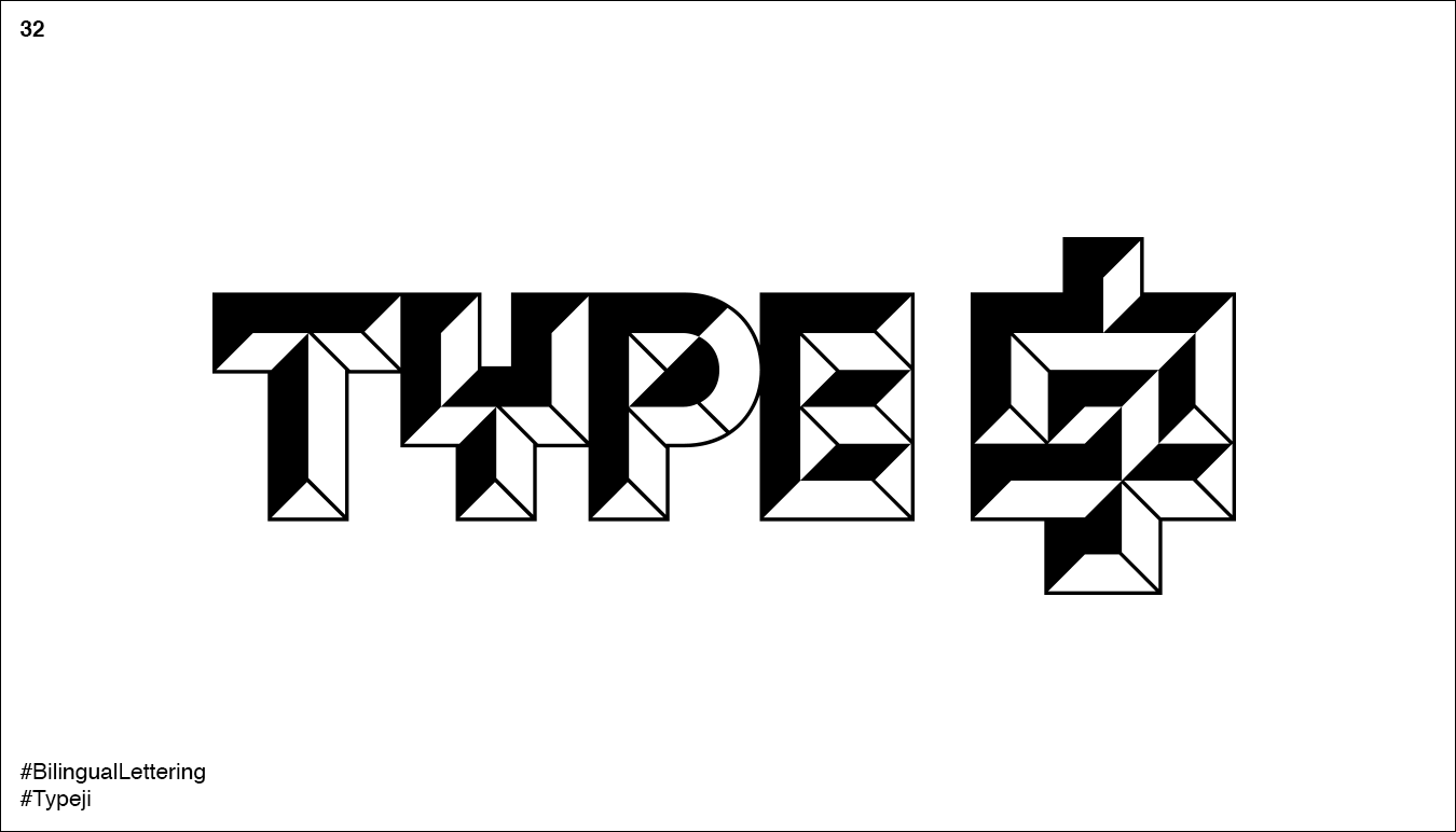

According to TienMin, “Typography tells stories simultaneously through its content, form and the way it sounds to the reader. Under our current multicultural environment, a brand designer should not only be able to use multi-language typography properly in the visual system but also be capable of bringing the same “look and feel” into the logotype or lettering.”


She feels that the most important criteria for designing a bilingual lettering is whether or not it is able to express the ‘the same personality’ in both scripts, under the premise of designing with legibility and basic type knowledge, rather than limiting to sharing a ‘similar appearance.

Stay connected with news and updates!
Join our mailing list for the latest updates about Typism Summits, Books, Membership News, and the Latest Lettering Challenges.
We hate SPAM. We will never sell your information, for any reason.