Flashback Series: Iconoflage
Jun 02, 2020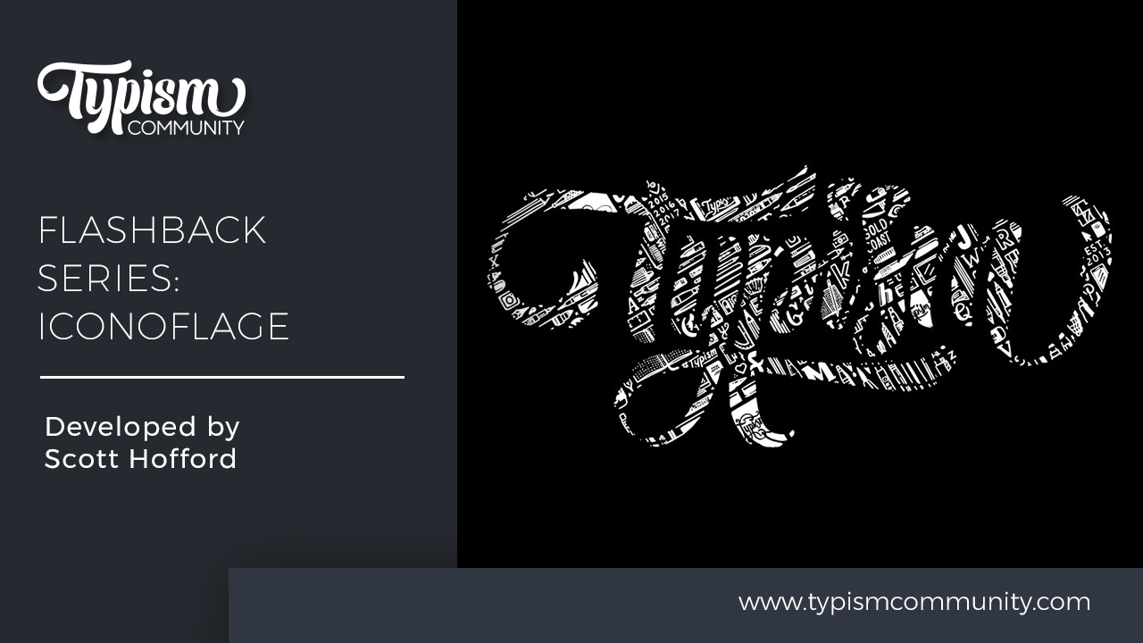
We recently took a trip on the Way Back Machine to locate some of our blog posts from the archive. Man what a trip! So many great things happened on the old *hacked* Typism website that we want to share them with you again in our Flashback series!
Back in 2017 when life wasn't so crazy, we brought you a story about Iconoflage. Scott Hofford has been working on this style of graphic artwork for the better part of 10 years.
i•con•ō•flage
Noun: Artwork, typically of a logo, composed of many iconic illustrations that pertain to a brand
Originally starting life as doodles on scraps of paper, Iconoflage slowly developed from Scott’s obsession for detail and passion for branding. It started as a means to practice his hand-eye coordination and creativity while binge-watching Netflix—although back then, the shapes were more amorphous and there wasn’t a specific topic.
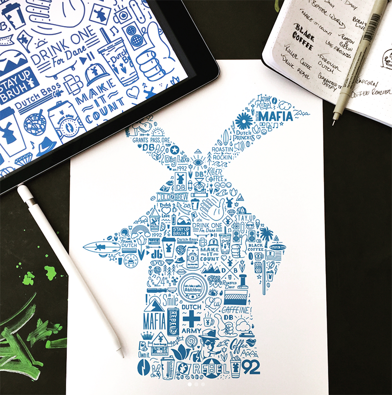
Fast forward to today, now every icon Scott draws as an Iconoflage reveals the visual DNA embedded in each brand mark.

Before Scott makes a mark, he begins by researching the topic. He digs through the history to learn more about the subject and looks for things that people associate with the brand. During this stage, he takes down notes and sketches ideas for icons that can be used in the artwork.
After researching, it’s time to start drawing. Scott creates a template to fill then goes to work drawing each icon. The biggest challenge Scott faces is finding a way to make each icon interlock with the others around it while maintaining uniform spacing between them. As he progresses through the project, he continues researching for ideas until he fills up the entire logo with illustrated icons. His work for the Optimist project, for example, examines the life and work of New York designer Eric Friedensohn and incorporates his life and work into Eric’s logo.


The result is a visual description of the brand or person in a unique way that can be used for virtually any application. Whether you see it used in a visual identity or product and apparel design, the viewer becomes immersed in the artwork as they discover each icon and what they represent. Another example is the Tinlun logo of Houston designer, Terence Tang, who balances branding with a passion for photography.

You can find Scott sharing his work on Instagram, Facebook, and Twitter at @scotthofford.
Stay connected with news and updates!
Join our mailing list for the latest updates about Typism Summits, Books, Membership News, and the Latest Lettering Challenges.
We hate SPAM. We will never sell your information, for any reason.