Typism Feature Interview: Dan Forster
Sep 23, 2024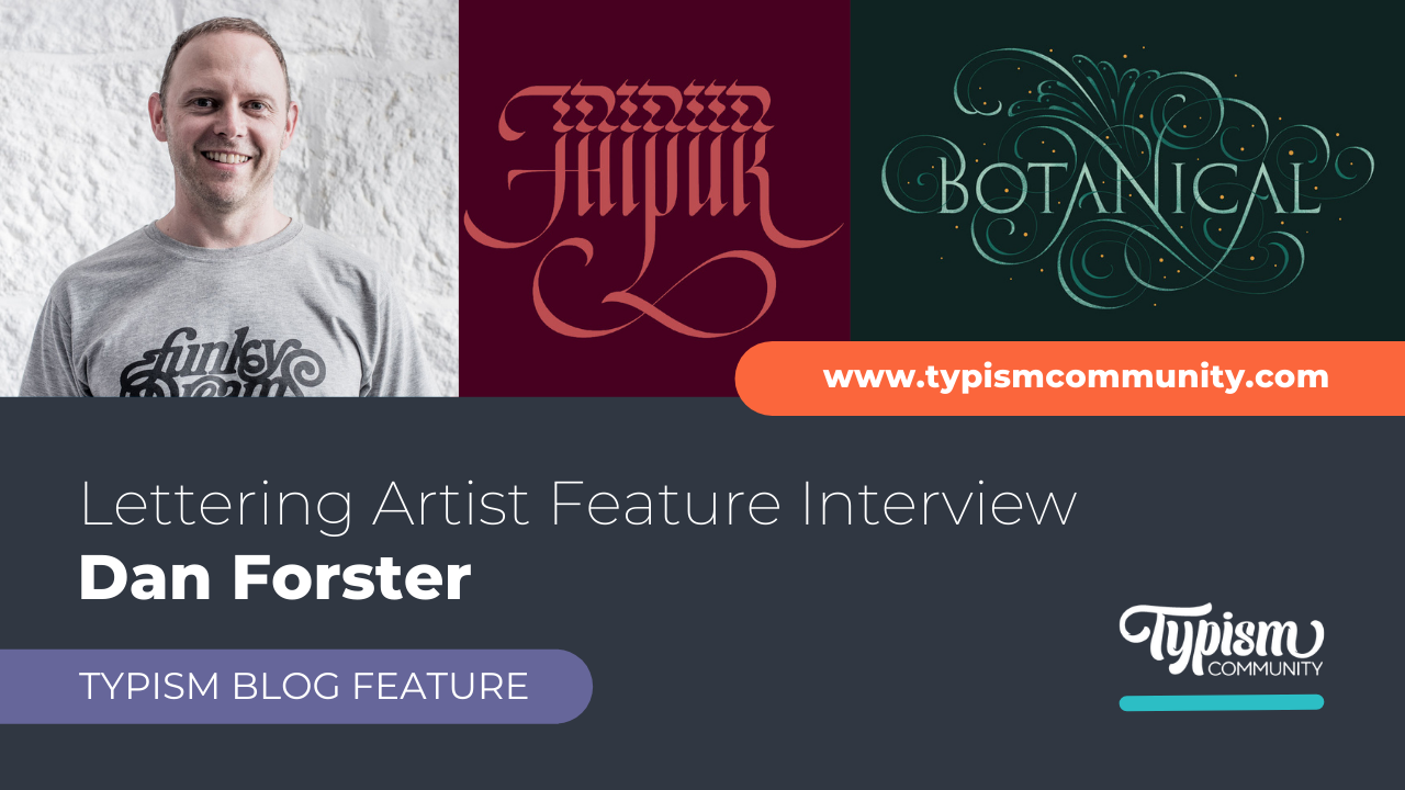
Dan Forster is an award-winning independent lettering artist and type designer.
He works with agencies, brands and direct clients from around the world on all manner of type-based projects, from custom wordmarks to highly flourished and decorative lettering to illustrative and three-dimensional type.
He strongly believes in the importance of personal work, experimentation, and actively seeking inspiration from outside sources, such as travel, architecture, cultural references, and more, to help bring fresh perspectives and greater expression to his type and lettering work.
What initially inspired you to start lettering, and how did you discover your passion for it??
It’s all really down to my Dad. I was lucky to grow up surrounded by his lettering, calligraphy and type work, so it was hard to ignore. Having said that, he had me try calligraphy in my early teenage years, and I hated it! I got so frustrated that I couldn’t make the letters as good as I wanted.
Initially, I pursued graphic design, which I ended up doing for the first part of my career. It wasn’t until after my Dad passed away in 2008, and I was tasked with tidying up his studio, that I got inspired to try my hand at lettering again. I discovered so much incredible work that it literally inspired me to pick up a pen again—once I started, I couldn’t stop, and I quickly fell in love with letters.
Over time, I started sharing my work on Instagram and eventually picked up some commercial work. It wasn’t an overnight change; I had to continue with graphic design work for a few years while I built up my lettering portfolio and clients. After a few years, I made the transition to full-time lettering artist and never looked back.
What advice would you give aspiring lettering artists just starting and seeking inspiration?
Firstly, I’d say focus on getting the fundamentals right (form, proportions, weight placement, spacing) before getting too ambitious with things like decoration and flourishing. No amount of embellishment will disguise bad lettering. That’s not to say don’t do it at all but always prioritise the letters.
Regarding inspiration, study other people’s work closely—as much and as often as you can. I believe at least 50% of being good at something is down to the simple act of observation. It’s often said that you shouldn’t compare yourself to others. But we all do it, and to be honest, I think it’s a good thing as long as you’re realistic with yourself about your level of experience vs. whoever’s work you’re looking at.
Also, don’t be put off when your peers or anyone else is described as talented. I think the word talent is overused and is often misleading or even intimidating to those just getting started. It kind of suggests that people have some kind of magical super-power or gene that means ‘they’re just good at something from day one’. But I reckon what’s more likely is they’ve been doing their thing for a long time with a lot of hard work, persistence and a lot of love. I think those are the ingredients you need to get good at something—and I think anyone with enough of this can become great. Or ‘talented’ :)
Something else that really helped and inspired me was when I accidentally read a little about the history of type (it was the introduction to the book Letterforms: Typeface Design from Past to Future by Timothy Samara, which I’d highly recommend). This sent me off down a rabbit hole studying and learning about type history, which surprised me at first because, before this, history had never been a subject I was remotely interested in.
But in the context of type and lettering, I became hooked and found it incredibly inspiring. So, I’d encourage other aspiring lettering artists to do the same. When getting started with lettering, there are always a lot of questions, and I’d say history holds a lot of the answers.

What are some essential techniques or skills that you believe every lettering artist should master?
Calligraphy, for sure. I don’t think you have to be good at it, but understanding how different pens make different marks is crucial knowledge. A lot of lettering is essentially just an emulation of calligraphy. The beauty of lettering is the freedom to take things beyond what the calligraphic pen alone can do. But the pen dictates the fundamental forms, contrast and weight placement. Once you master these, then you can start to bend the rules, and things get really interesting!
Composition is a big thing. Especially when it comes to flourishing or illustrative elements. So, ensure your lettering piece feels balanced, and you don’t have too much detail or flourishes clumped together in one particular area.
As an extension of that, I’d say observing space and ‘typographic colour’—it’s a phrase that comes up more in type design, but it’s super-relevant to lettering and flourishing, too. For instance, when you squint, does everything feel evenly weighted and spaced throughout the whole composition, or are there any heavy areas of detail or white space that jump out?
And, of course, pay attention to the negative spaces (and shapes) too. Try to avoid any tiny negative spaces where shapes are overlapping too closely—as this tends to create messy areas that draw the eye and can be distracting.
The last one I guess is more about attitude, but is still something that can be learned. I’d say perseverance and persistence are super-important. Lettering can be hard and frustrating when you’re first getting going. But if you find something hard, it probably means you’re pushing yourself beyond your comfort zone, which is always a good thing.
If you’re really struggling, a trick I’ve learned over the years is to step away for a while. Go for a walk or leave it alone overnight. Sometimes, I’ll park projects for months (well, not client projects). Then, when you come back to it, I guarantee you’ll see it with fresh eyes and likely be able to spot where you can fix things or make improvements.
Can you describe your process for developing and refining a new lettering style or project?
I think it’s really rare/difficult to create a truly new style. Most of the time, we end up creating a derivative of something else, whether we know it or not. Having said that, it is something I’m always aiming to try and do—or at least make a fresh take on something. I think unique work can happen when we start to look beyond our usual points of reference and take inspiration from outside sources.
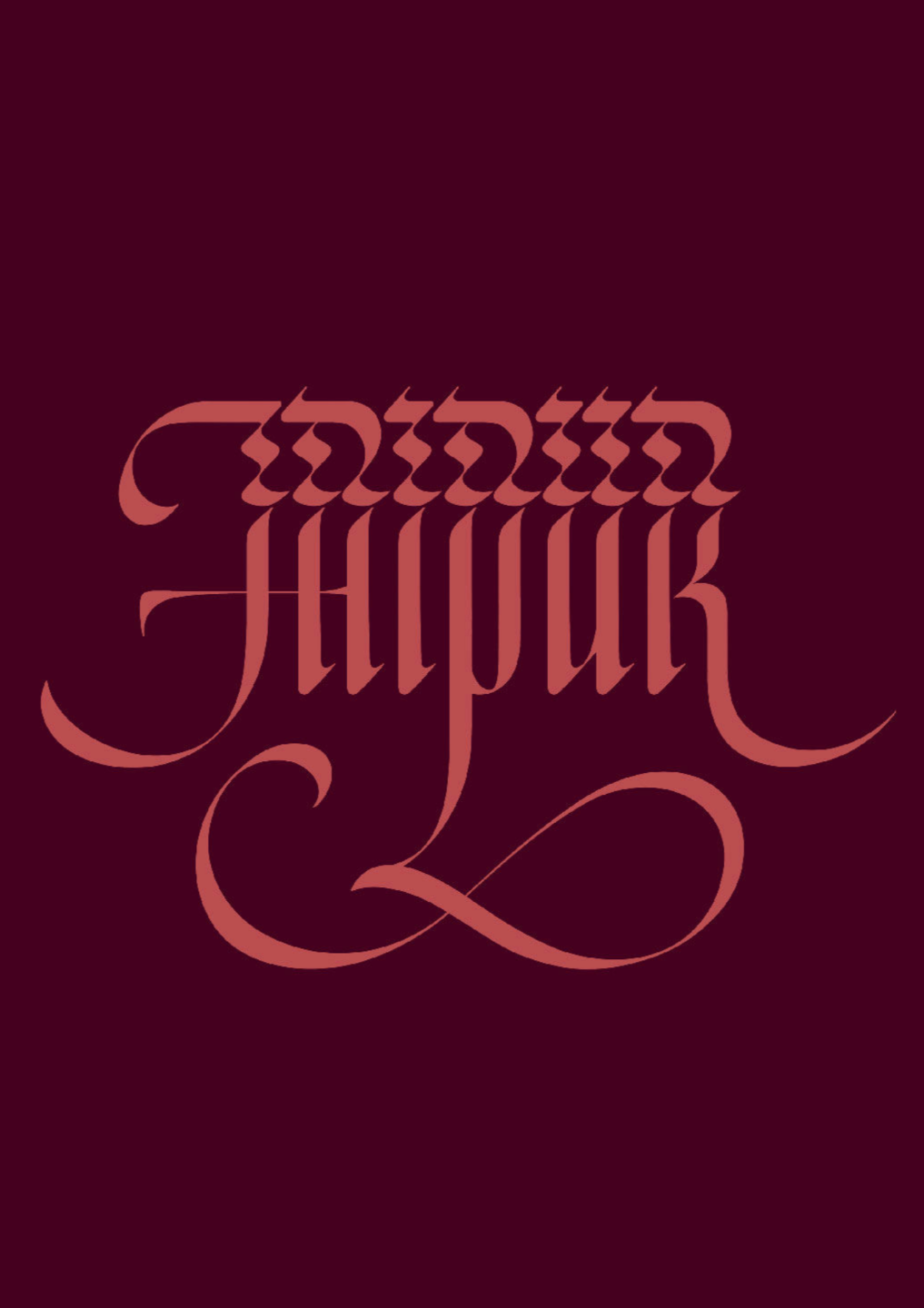
To give an example—I always like to make work while I’m away travelling, and last year I was in Jaipur, India. It’s a beautiful place but off-the-scale hectic! One thing that struck me was this permanent, shimmering haze hanging on the horizon, caused by a combination of the heat and smog. This 'shimmer' was something I tried to weave into the letterforms of the word ‘Jaipur’—a sort of disturbance to the beauty. I think the final design turned out pretty well. But I never would’ve got to this result by just thumbing through Instagram for inspiration.
What strategies have you found effective in promoting and monetising your lettering work?
I think the main thing is just trying to make myself visible. Not something I was really comfortable with at first, but a necessary thing if you want to stay top of mind with your clients. Of course, you need to be active on social media, but I think in-person meetings can be much more effective. A couple of years ago, I started doing a lot of agency talks. I think actually getting in front of people and doing a short presentation about your work and process is far more memorable than just emailing a PDF.
Also, keep in touch with people. If you haven’t worked with a particular client for 12 months, get in touch to update them on your latest work or compliment them on some work of their own that you might’ve seen lately. But don’t hassle them, though, and don’t worry if you don’t get a reply straight away. People are busy, and replies can sometimes take a while.
How do you balance the creative and business aspects of your lettering career?
I won’t lie; I sometimes find it a challenge. Admin can be tedious but a necessary evil. The best way I’ve found is simply to put it in your calendar and then just get on with it when the time comes. Also, blocking out time for particular tasks can be effective. Like setting aside a particular block of time to get all your emails or quoting/invoicing done.
Having said that, and with regard to the creative side of things, ideas can hit us at any time. When they do, I usually try and write them down or do a super-quick sketch. That way I know it’s logged down somewhere and I can get back to doing the other thing without worrying about forgetting my idea. It’s pretty annoying when this happens in the middle of the night, though! :)
How do you manage your time and stay organised with multiple projects and commitments?
The only way I can deal with really busy periods is to make a plan in the calendar. If possible break things down into smaller achievable chunks. Then turning off all distractions and simply getting my head down.
Also, if budgets allow, hire help for the more menial tasks. I recently hired a creative friend to do four hours of scanning for me. There’s just no way I would have hit the deadline if she hadn’t helped. She also brought along an awesome playlist, which helped us both get through all the work.
Finally, I try not to work too late. Missing sleep will just mean the following day is not productive at all.
What future goals or projects do you have for your lettering career, and how are you planning to achieve them?
Oh, there are so many. One example is a typeface I have in the works, which I keep dipping into periodically. Hopefully, when client work calms down, I can dedicate some more consistent time to this, which is what it needs. I have a ton of ideas for alternate characters, serif and sans versions and weight axes. But being realistic, the only way I’ll get this out in the world is to release a basic version first. Then, at some point later on, create a 2.0 version with all the bells and whistles. That’s the plan anyway. We’ll see if I can hold off on that extra fun stuff. Haha!

We hope you enjoyed our feature interview with Dan Forster.
For more of his work, visit Dan’s website or follow him on Instagram @danforster
Stay connected with news and updates!
Join our mailing list for the latest updates about Typism Summits, Books, Membership News, and the Latest Lettering Challenges.
We hate SPAM. We will never sell your information, for any reason.