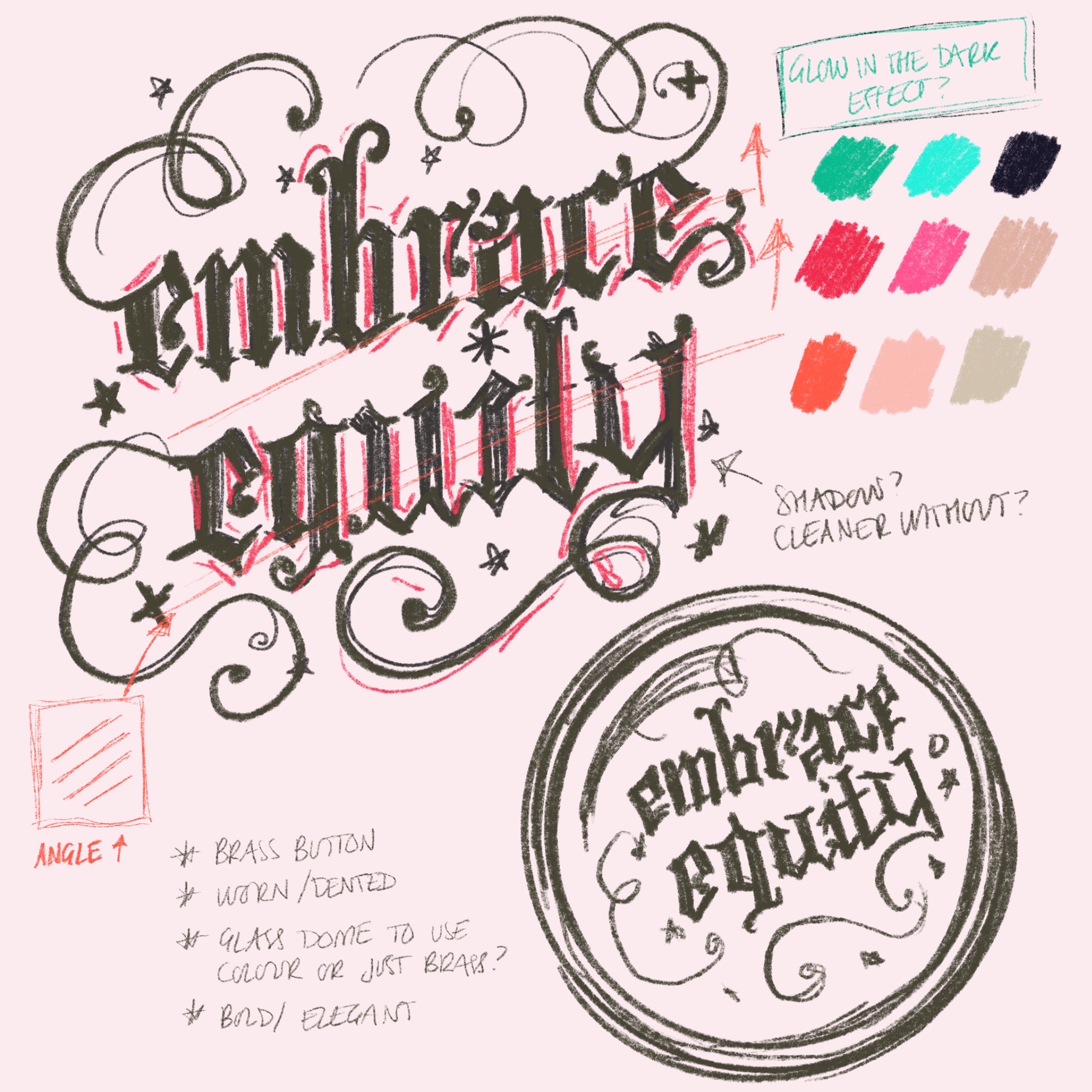
Embrace Equity Lettering Challenge
Mar 07, 2023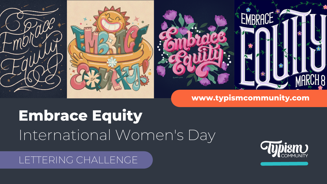
The 8th of March is International Women's Day, and yet again, we want to take the opportunity to highlight and celebrate all the incredible female lettering artists in our community!
We partnered with International Women's Day to encourage lettering artists worldwide to unite and #EmbraceEquity. Below are some of our favourite submissions so far.
Embrace Equity
Jin Kim | @jinsdesk
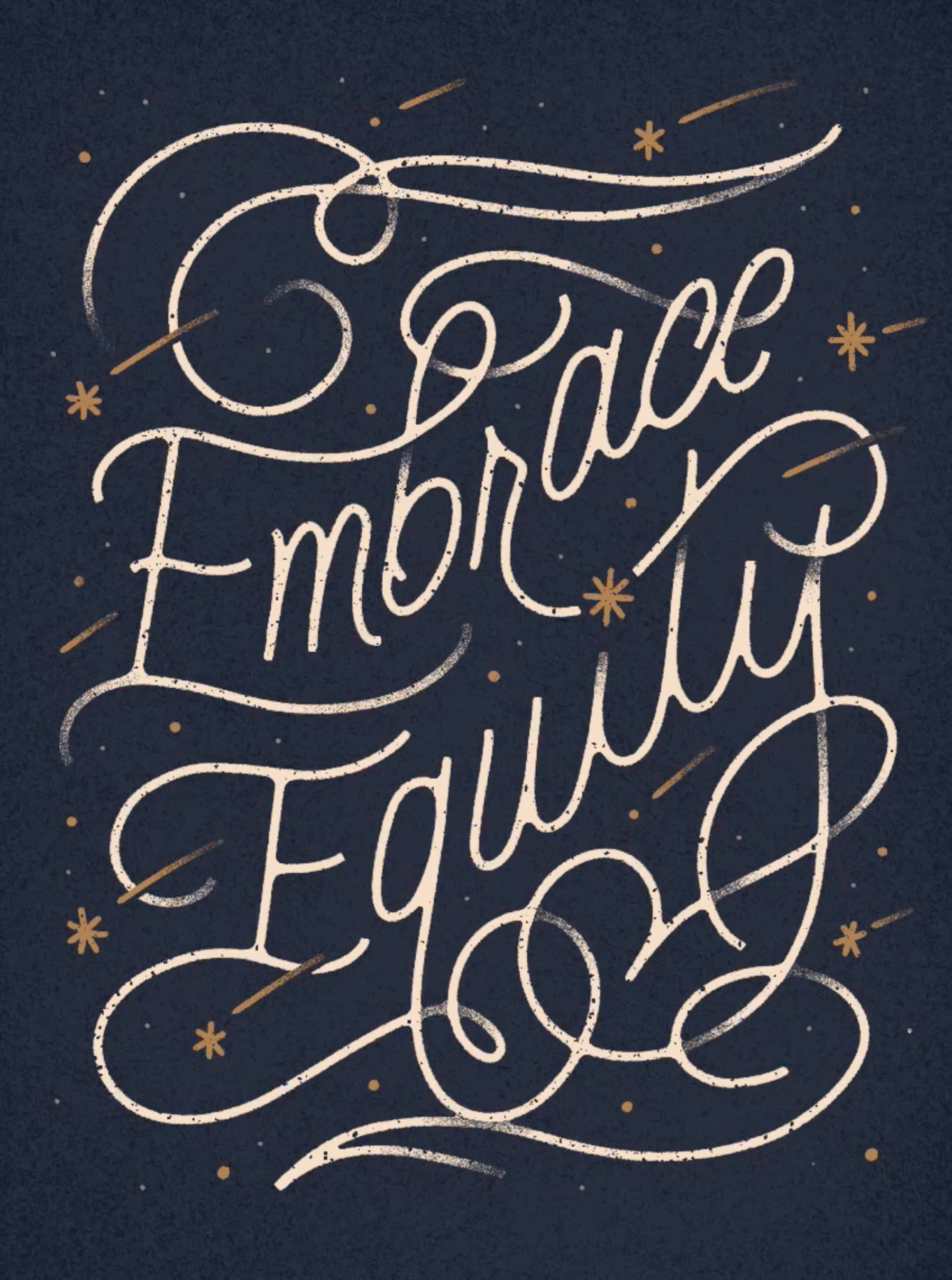
What is the concept behind your design?
I really wanted to focus on how the meaning of "embrace" made one feel when looking at my piece. By definition, embrace means to accept or support (a belief, theory, or change) willingly and enthusiastically. My piece has a lot of movement because if one was to embrace someone or something, it would have a lot of emotion and gusto to it. The elaborate flourishes bring balance and intricacy to the piece. The idea behind having them is to push that idea of "embrace" again with how the flourishes curl and bend with each other.
What was your process for creating the artwork?
I started by going through my most recent work to get some ideas on the composition and style of the piece. I wanted this artwork to showcase my style, and going through my latest work helps to hone in on that. Lately, I've been doing everything exclusively digitally. I use my iPad with Procreate. I knew I wanted to show a lot of movement in my piece, so I added an upward wave to the composition and planned to have elaborate flourishes.
After an initial sketch, I refined the letterforms to feel balanced and evenly spaced. Once the letters are mostly finished, I look back and decide where the flourishes go to fill out the composition. Embellishments, like the stars, dots and lines, come after the flourishes are mapped out. Afterwards, I play with colour until it's the right palette I want. For this specific piece, I wanted something more serious with high contrast. So a dark navy background with off-white lettering made sense to me. The last step was to add details like shading and texture.
Do you have any views or comments about gender issues relating to the world of 'women and typography'?
Women with a craft in type are such a powerful combination. Utilising communication arts as women will give us a voice to accelerate social change. Typography, like most other "technical professions", is considered a male-dominated field. The problem with having one gender being the bias in design is that it can skew how we communicate. Women designers and artists are essential worldwide and must be supported.
Kim Burke | @bdckim
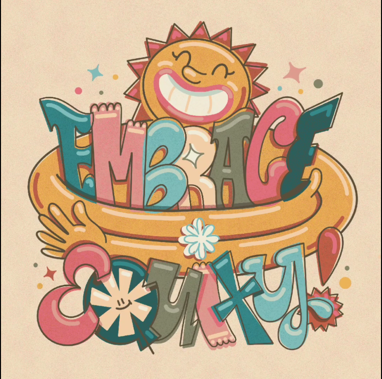
What is the concept behind your design?
When I saw the 2023 International Women’s Day theme ‘Embrace Equity’, I knew I wanted to visually represent the concept of ‘embrace’ in a fun and uplifting way. I thought of a smiling sun squeezing the phrase's letters in a big hug. I made each letter unique as a nod to all the different types of individuals living and working together under that same sun. I thought a retro style could be a way to look back and celebrate how far we’ve come but also serve as a reminder that there is still work to be done to ensure everyone is treated equitably.
What was your process for creating the artwork?
This piece was created from start to finish in Procreate on my iPad.
What does it mean to you to Embrace Equity?
Everyone comes to the table with unique experiences and abilities. It is vitally important to make room for everyone at the table and do the necessary work to ensure everyone is given an equitable opportunity for their individual stories to be seen and heard. It is more than simply treating everyone the same. It intentionally provides the necessary opportunities and platforms based on individual needs.
What does International Women's Day mean to you?
I love that we can celebrate the unique accomplishments of women as well as provide a platform for women’s voices. We have come so far, but work is still to be done.
Do you have any views or comments about gender issues relating to the world of 'women and typography'?
I have felt the strain and burden of balancing my career work and aspirations as an artist with my responsibilities as a wife and mother. I constantly have to choose between working towards my career goals or working for my family at any moment. I think it is possible and admirable to be a successful artist, wife, and mother, and I wish it didn’t have to feel like such a fight or like one part of my life must be sacrificed to make progress in another.
While it is getting better, and women have made significant professional strides without sacrificing family, it seems like there is still work to be done for both genders to share in the responsibilities and make room for women to reach their full potential in all areas of life.
Jennifer Greive | @jennifer.greive
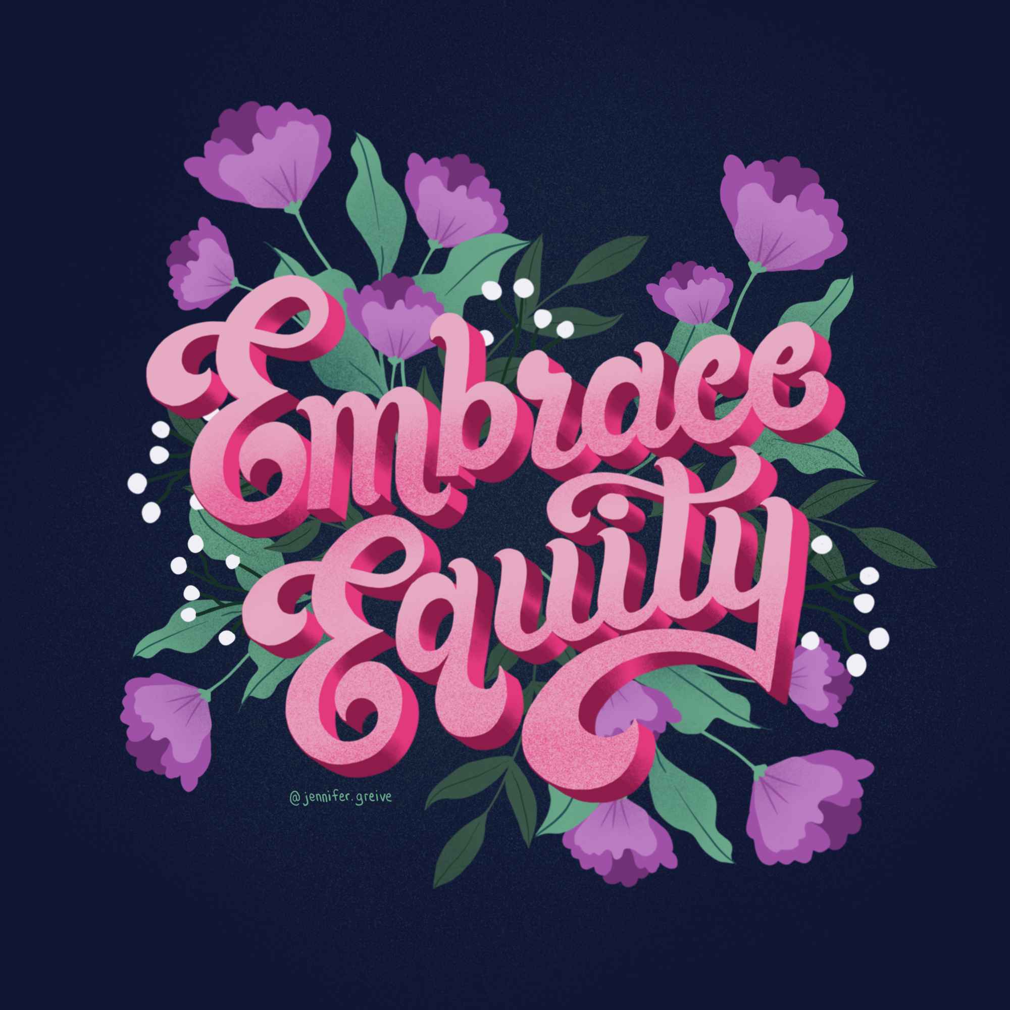
What is the concept behind your design?
I am a fan of the 70s script. Before I started working on my piece, I also knew I wanted to use flower illustrations in my art. The colour palette is always the trickiest. I wanted to be able to represent all women by using pink and dark blue. Though, of course, when you think of women, you think of the colour pink; it's imprinted into our heads from society. So I did want to try and go out of the norm and not use ALL pink for my colour palette. I always find that dark blue and a mix of colours always turn out really well.
What was your process for creating the artwork?
I always gather inspiration and illustration references when I create something. For the lettering, I referenced a piece I did for International Women's Day/Month a while ago. I wanted that same vibe with the swooshes. I figured it would work to embrace equity as well.
What does it mean to you to Embrace Equity?
I have always wanted equality and equality for everyone. No one is superior to the other. I always support other artists- men or women—we all need support somewhere. Showing support for each, no matter race, or gender, really helps in the long run in today's society. I never see someone as different. We are all the same and should be treated as such.
What does International Women's Day mean to you?
I know it's just a day they put on the calendar, but we should celebrate International Women's Day all year, not just a day or month. We still all go through unfair advantages because we are women. I hope someday that it will change. Women can do anything when they put their minds to it.
Do you have any views or comments about gender issues relating to the world of 'women and typography'?
I can't say I do, to be honest, as I'm sure there are still unequal things out there based on gender issues with women and typography. Sometimes we get perceived as having a lower standard and little praise. I know when freelancing in my career [not that I do it much now], there were many times when clients disagreed with my pricing. I have never wanted to downgrade my self-worth because of some client that can't afford me.
What is the concept behind your design?
My take on this piece was to go bright, bold and playful. I used two different lettering styles and forms to emphasise the two words that make up the phrase. Giving both words distinct treatment and stylistic features continue to embrace the message, celebrating individuality and uniqueness.
What was your process for creating the artwork?
Similar to how I approach most of my artwork, it is all done digitally on procreate. I start by sketching variations of the word placement and the lettering style I want to develop with this piece. After figuring out the form and structure of the lettering, I experimented with different colour palettes until I was happy with the result. The last step of the process, which usually takes me the longest, is adding all the extra detail to give the piece more personality.
What does it mean to you to Embrace Equity?
Do you have any views or comments about gender issues relating to the world of 'women and typography'?
The distinct advantage we have as female lettering artists and graphic designers is that we can be very direct with the message we want the audience to see. I’ve noticed this with many Asian female letterers/designers during the “Stop Asian Hate” movement over the past few years. We can say it like it is through the artwork and use that to raise voices for communities that usually wouldn’t have the opportunity before. This gives me hope to know what we can do with our power through typography to continue spreading awareness on gender issues.
Carol Gunn | @gunngraphicsaustin
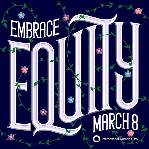
What is the concept behind your design?
My design features this year’s “Embrace Equity” theme in a unique custom typeface. I created the type in a classic style with serifs and an embossed inline; a style passed down from the ancient Romans who chiselled it onto temple walls and halls of government. Since the concept of equity requires public acceptance and legislation, I wanted to create this custom type with a similar feeling of dignity and timelessness.
The vines represent a spirit of growing, reaching out, intertwining, and embracing the type. The pink flowers represent women; the blue flowers represent men (because more rights for women does not mean fewer rights for men); and the purple flowers represent all gender identities between the pink and the blue.
What was your process for creating the artwork?
I created several rough thumbnails and quickly decided on one. In a looser design that would more closely resemble lettering done with a brush or pencil, I might have made a more detailed sketch by hand and then traced it in Illustrator to clean it up. But the classical constraints of this design made it perfect to create from scratch in Illustrator with its exact guidelines, geometric shape tools, and precise pen tool. After drawing the outlines and filling them with flat colour in Illustrator, I exported paths and pixels to Photoshop, where I added depth, highlights, and shadows.
What does it mean to you to Embrace Equity?
What does International Women's Day mean to you?
Do you have any views or comments about gender issues relating to the world of 'women and typography'?
My experience with typography began with my first job in the art department of a newspaper, back when gender-based inequity was so institutionalized as to be considered a way of life. Even though the Supreme Court had already passed its landmark ruling that discrimination “based on sex” was unconstitutional, entrenched attitudes took a long time to begin changing, especially here in the Deep South. When we raised the issue that women at the newspaper were paid less than men doing the same job, our supervisor said, “Men have families to support so they need to be paid more.” We just stood there, gob-smacked!
But that is the moment s**t got real. This was when it hit me that women’s “liberation”, as it was called then, wasn’t just a hippy-dippy, touchy-feely nice idea, but these were our lives and our livelihoods we were talking about! And so began my years-long fight for women’s rights that has lasted to this day.
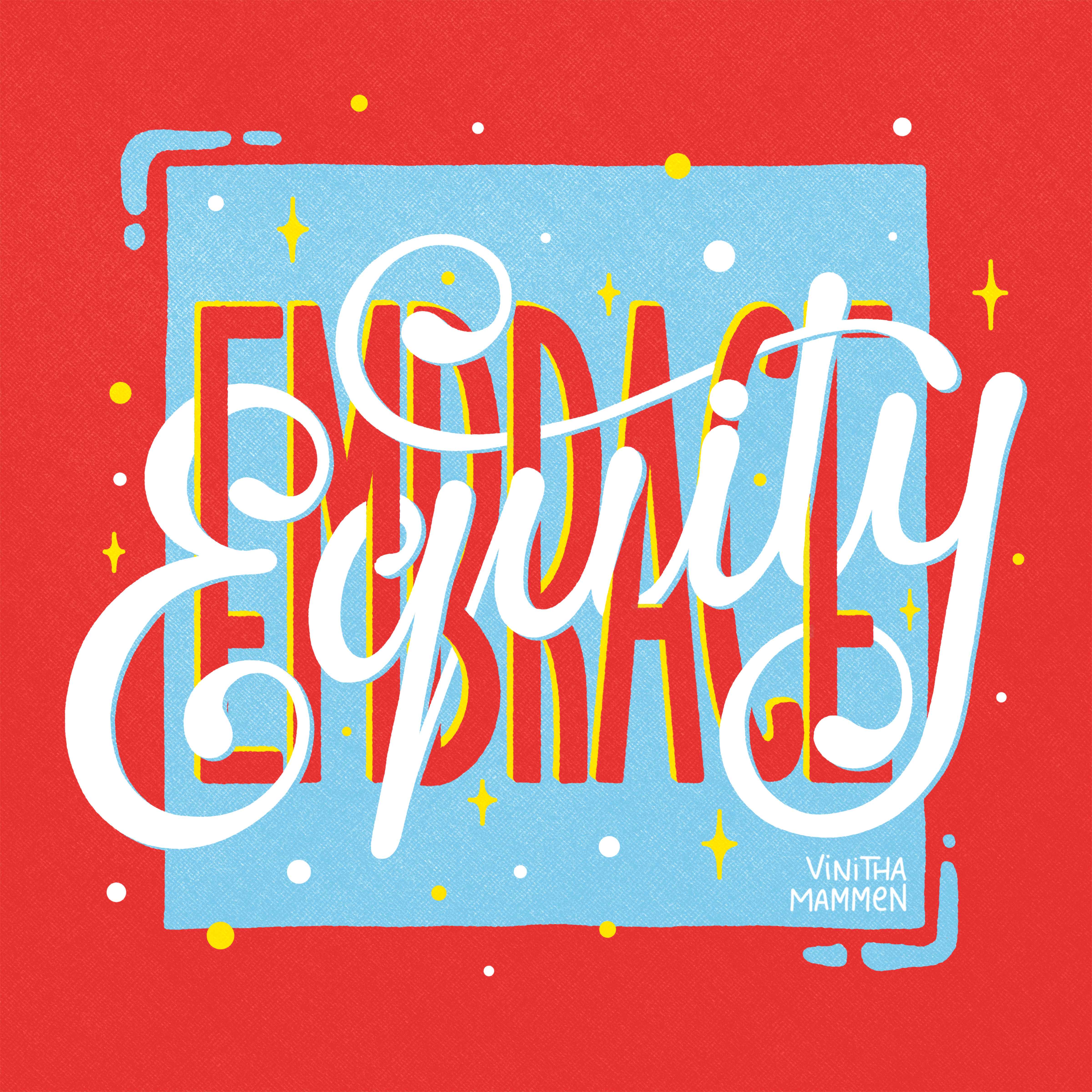
Vinitha Mammen | @vinithamammen
What is the concept behind your design?
When I thought about the concept for this piece, I wanted the two words 'Embrace' and 'Equity' to be embracing each other in a way that interprets the official IWD 2023 pose in a lettering context. I also wanted to keep the colours bold and high-contrast so it feels uplifting and hopeful. Hope is what we all need to keep pushing forward in this long and persistent fight for women's rights.
What was your process for creating the artwork?
This artwork was created entirely within the ipad drawing app, Procreate. I started with some grid layouts and skeleton sketches which I progressively refined into a finished full-colour piece. The letters of the word 'Embrace' were laid out with a flat brush in a clean minimal sans serif style and 'Equity' was then woven into them in a script-style with a subtle 3D effect. The lettering was then nestled into a freehand bounding square to complement it with some elements 'breaking out' of the box to create visual interest.
What does it mean to you to Embrace Equity?
Embracing equity, to me, is about not assuming that everyone's needs or challenges are the same. True equality applies only when everyone is at a level playing field to start with, and equity is the way to get there. Women have a long way ahead of them to even remotely be at the level of advantage men have in our gender-biased, patriarchal society and it's important that this is acknowledged and addressed, both on a personal level and on a systemic level.
What does International Women’s Day mean to you?
International Women's Day to me is not just a day to celebrate women but it's an opportunity for women and allies to come together in solidarity for women's rights. It's a bit bittersweet personally because around this time of the year, my social media feeds are full of empowering content for women but also suddenly so many of the problems we go through are everywhere in front of us. However, initiating conversations about our challenges is an important part of moving towards solutions and is so so valuable in helping each other feel validated and less lonely in our journeys of womanhood.
Do you have any views or comments about gender issues relating to the world of ‘women and typography’?
I'm very happy to say that in my journey so far as a woman lettering artist, I've found the space to be nothing but welcoming. We women of type are collectively a force to reckon with and I love that! I think typography is a powerful space for us women to be in. There's so much potential to reach out to other women through lettering and create content that makes the world a better place for women. I feel so honoured and privileged to be in this space where I can use my art to change lives in even the smallest ways.
Kate Beck | @kate_letters_lots

What is the concept behind your design?
When I first saw the theme for this year’s International Women’s Day— “Embrace Equity”—my first thought was about the definition of “embrace”, which means “hug.” I wanted to focus on the warm and fuzzy, kindness and empathy evoking feelings that this concept would produce. I added stylized hands to the most ‘arm-like’ parts of my letterforms to make it look like the letters were embracing each other. I also overlapped my letters slightly to further the ‘hugging’ effect. Finally, I used bold colours and funky shapes for my letterforms because they are my favourite qualities to incorporate in my designs and because colourful, fun designs make me happy.
What was your process for creating the artwork?
I don’t always have the most consistent process when making art, but I always start my designs with a very loose sketch, which helps me get a feel for the spacing and composition I want my piece to have. For this piece, I tried to let my letterforms flow into each other—almost as if they were really “hugging.” I try to be consistent with my sketches' development, but it usually varies quite a bit depending on my idea's clarity.
I use Procreate for most of my art, but I sometimes switch back to pencil and paper if I'm struggling with a sketch. After I get my sketch down, I start blocking in my shapes—usually in black and white, but sometimes I go straight to colour. I started adding colour pretty quickly for this piece, which I sometimes struggle with because it can make my designs turn into a giant rainbow puddle. I really love colour!
My final design for this year was still pretty rainbow-y though, which is how I like them. I often work with complementary colours because I love how bold and eye-catching they are. After adding some colours, I decided to use blank space and offset my letters from my background to provide some contrast. My final touch for all my pieces is always to add paper texture for visual interest and usually some star forms. I love mid-century modern-style starbursts, so I added that as the final part of my design to balance the blank space in my piece.
What does it mean to you to Embrace Equity?
I think I first learned the word "equity" sometime in grade four or five, and it was presented to me with the famous cartoon example of people standing on different stool heights to see over a fence.
This was an excellent visual example for young me, and it is still my first thought all these years later. I find myself returning to this basic example to explain what Equity means.
At its most simple, embracing Equity is about welcoming fairness and justice. Is my head higher over the fence than the person next to me? Can I do something about that? What might that person need to get their head to the same level as mine?
I am a white woman and very privileged because of that. As I get older, a big part of understanding Equity is understanding my privilege in society and then using that privilege to make space for others who have not been afforded by society the same chances I have. That is not necessarily an easy task.
It can be hard to get out of your head and see how other factors like race, sexuality, and gender impact equity, especially when they might not be something you deal with directly. This is when it becomes necessary to listen.
'Intersectionality' is an essential word in the world of feminism. It means understanding and learning about the complicated ways these other factors interact, especially concerning being a woman.
So really, to me, "embracing equity" means recognising intersectionality, learning to listen to other perspectives before acting, and then using my privilege to make a positive and meaningful difference whenever possible.
What does International Women's Day mean to you?
There are a few pieces to celebrate International Women's Day. First, it is essential to consider how far women's rights worldwide have come and how far we still have to go. Some issues close to my heart are reproductive rights and women's safety. I always think more about these issues in the lead-up to International Women's Day and wonder how to better incorporate the issues I care about into my work.
Thinking about these issues can be heavy and scary, so sometimes it feels tempting to avoid them together, but it's important always to try to stand for what you believe in. International Women's Day is an excellent reminder to do just that.
Another essential part of International Women's Day for me is celebrating being a woman. Being a woman is pretty cool! There are so many amazing women to look up to in my life, and in previous years I've focused on making art that pays homage to them. I've done art recognising people like Maya Angelou, Katherine Hepburn, Michelle Obama, and other women I admire.
It can be easy to get bogged down by the hard things that women still face in their everyday lives, and it is essential to pay attention equally to all the amazing things that women have done and will do. Being a woman gives me unique perspectives and ideas that others might not have, and it is fantastic that I can share these perspectives through art.
I see the world differently based on who I am and how I identify, and I bring these views and opinions to every project I approach. I aim to bring more of myself and the issues I care about to my art.
My favourite art pieces always included the most of myself and what I care about—passion is always evident in art.
Do you have any views or comments about gender issues relating to the world of 'women and typography'?
Men dominate design and typography like many fields, especially in the uppermost positions. That said, there are so many amazing women working in design, and it has been incredible to watch them carve out their own spaces in the design world. I am proud to be part of fantastic typography communities like Typism and Women of type (@womenoftype on Instagram), which help women do this.
Earlier this year, I was lucky to be featured in the first-ever Women of Type book (available now!). Communities like that make being a woman in typography a fantastic and formative experience. My mom is also a graphic designer and one of these enterprising women in design.
She is one of my biggest inspirations and has always been the first and loudest supporter of any work I do. Seeing people like her (and, by extension, like me) is the best inspiration I could ask for.
I look forward to watching more women succeed in the design industry, and I hope to carve out a space for myself in the typography and design world.
Gemma Flowers | @theluckytype
What is the concept behind your design?What was your artwork creation process?
What does it mean to you to Embrace Equity?
We don’t all start in life with the same advantages or disadvantages, and I believe embracing equity is necessary to level the playing field to achieve true equality.
What does International Women's Day mean to you?
International Women’s Day is so important because it can educate and highlight how much further we still need to go to make life and opportunities fair and equal for all women.
Do you have any views or comments about gender issues relating to the world of 'women and typography'?
Though I’ve found the lettering world to have leading creatives of all genders, I’ve personally experienced the general graphic design industry as more male-dominated (especially in UX/UI and web design).
That being said, even if we still have a little way to go, I think we’re closing the gap, and designers like Jessica Hische, Martina Flor and Lauren Hom are excellent role models for other women on the path to achieving the same success.
Sophie Elinor | @sophie_elinor
Before I read up on this year's International Women's Day theme, I used “equality” and “equity” interchangeably. I didn’t realise how different their meanings were. Equality gives the same resources to all, but equity recognises that individuals often need different resources to create fairness.
If we’re all trying to see over a fence, someone tall might need nothing, whereas someone short needs a step ladder. In any context, a thriving, level playing field requires a thoughtful and tailored approach.
Equity is a significant and complex subject, but I wanted to try and reflect a little of it in the animated lettering here, with the "I", "T", and "Y", each given differently-sized boosts to raise them to the same level. Blooming florals appear after this happens—a botanical celebration.
What was your artwork creation process?
Once I figured out my concept, the design started in Illustrator. I wanted the type to be strong and striking and for the illustrations to be supporting actors. It underwent a fair few rounds of changes before I brought it all into After Effects to animate. I've been trying to broaden my animation skills lately, and Manon Louart's online classes inspired a few of the techniques I used in this design.
What does it mean to you to Embrace Equity?
Broadly, I think it's about acknowledging that we have wildly differing circumstances and identities. Further, it's also about championing activism, initiatives, scholarships or support systems that seek to raise those who need it.
What does International Women's Day mean to you?
I love seeing all the celebrations worldwide, spotlighting the fantastic achievements of those who identify as women. It's inspiring and humbling. It's also a stark reminder that there is still so much work to be done.
Do you have any views or comments about gender issues relating to the world of 'women and typography'?
I think these are primarily the same issues that affect women in most industries—gender pay gaps, access to childcare for working mothers, and the general weight of mental load ... perhaps more specific to creative industries is the prevalence of imposter syndrome and the comparison trap.
Anecdotally, I see online a lot of creative women's work being plagiarised or appropriated by big brands. IP laws are so muddy, but it's essential to call out that disheartening behaviour and try to set a better standard.
Melanie Garber | @melanie4816_art
What was your process for creating the artwork?
I wanted to do something fun and colourful. This lettering style is one of my absolute favourites—I learned it from Dawn (@bydawnnicole); it’s her Chloe Style lettering. It’s a playful style of faux calligraphy that uses teardrop terminals.
I also used a lot of teardrops for embellishments with a rainbow colour palette. I considered the outlines with the extrusion as one of my signature styles and chose to do the outline in white to make it stand out. Lastly, I used a grungy texture for the background and the lettering to give it that extra dimension.
What does it mean to you to Embrace Equity?
Embracing equity is not about giving everyone the same thing but giving each person something that accounts for their circumstances and allows everyone to get to a similar outcome.
I used to use the phrase “we’re all in the same boat”, but upon reflection, I realized it’s perhaps not the best phrase—some of us might be in a yacht while others are in a lifeboat; I think a more accurate way to look at things is that “we’re all in the same storm” but what we have around us may or may not make it easier to weather than the storm—in an equitable world, the person in the lifeboat would be provided more resources than the one in the yacht.
What does International Women's Day mean to you?
It’s a day to celebrate and spotlight women worldwide and in different fields to raise awareness towards gender parity.
We will continue to share our favourite submissions to social media as they come in through March, so please, continue to tag #IWDtypism on Instagram.
Thank you to everyone who participated this year.
Stay connected with news and updates!
Join our mailing list for the latest updates about Typism Summits, Books, Membership News, and the Latest Lettering Challenges.
We hate SPAM. We will never sell your information, for any reason.