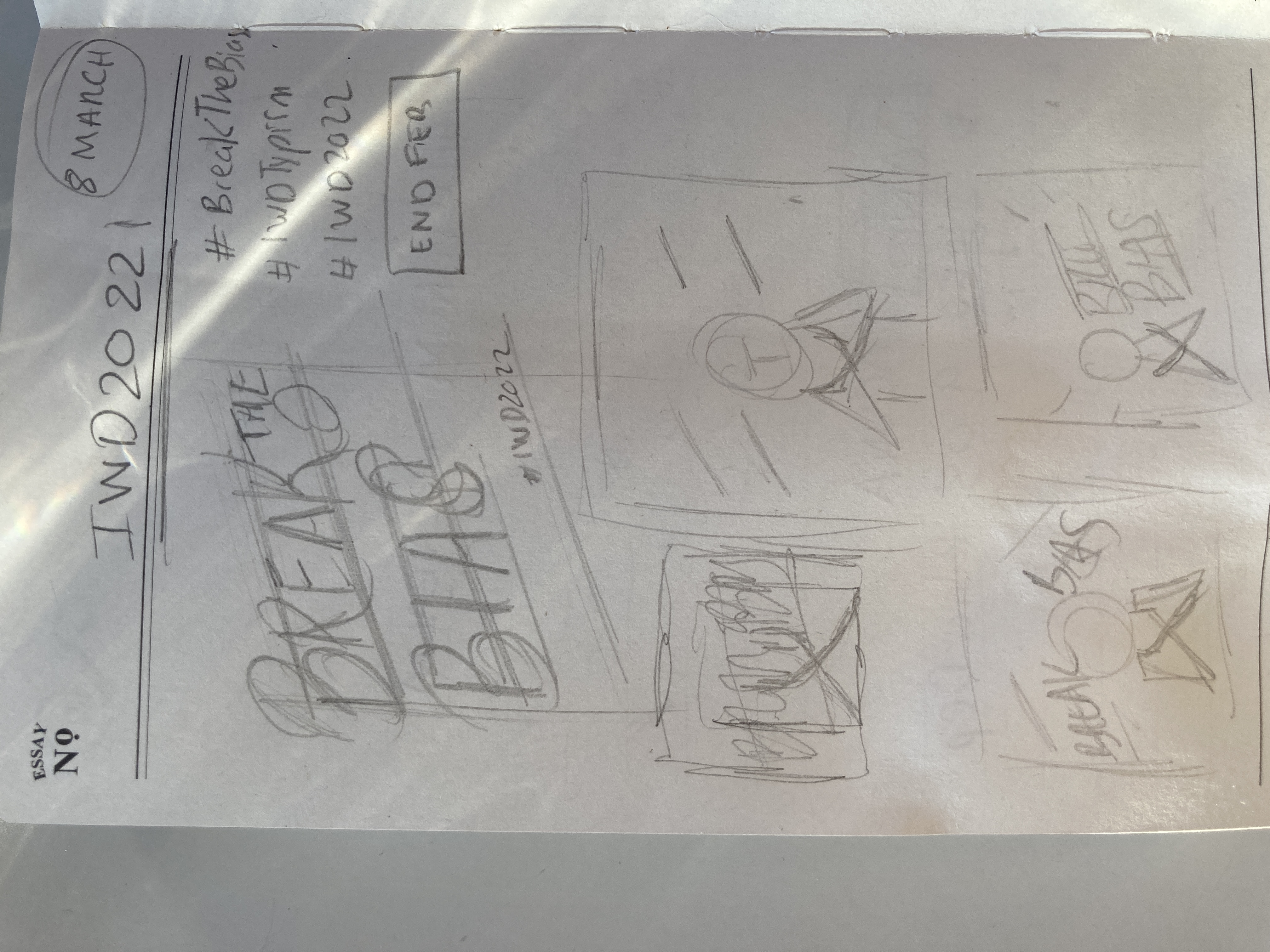
Break The Bias Challenge
Mar 05, 2022
The 8th of March is International Women's Day and yet again, we want to take the opportunity to highlight and celebrate all the incredible female lettering artists in our community!
We teamed up with International Women's Day to encourage lettering artists from around the world to come together and #BreakThe Bias. Below are some of our favourite submissions so far.
Break The Bias
Alba| @thisisalbaletterer


juänita arenas pedraza | @madame_arenas
What is the concept behind your design?
The concept of the design is simple, I was looking for typography with impact but with a handwritten look that represents the uniqueness of each woman.
What was your process for creating the artwork?
The process started with research into handwritten typography, then I designed each typeface to finally assemble the whole in a well-balanced composition.


What does it mean to you to Break the Bias?
For me Break the Bias is to act, not to be passive but to go beyond expectations and to accomplish challenges day by day.
What does International Women's Day mean to you?
IWD is a very important day not only for women but also for the whole society that has to remember that we are still fighting for equality in a world where we all have the same abilities but unfortunately are not valued equally.
Do you have any views or comments about any gender issues relating to the world of 'women and typography'?
Women today are still very stigmatized, the subjects we can work on are often related to the same universe (fashion, beauty, etc.) while we are able to be as successful on other subjects (like sports for example) where there are only men who are listened to and taken into account, which necessarily gives us less visibility.
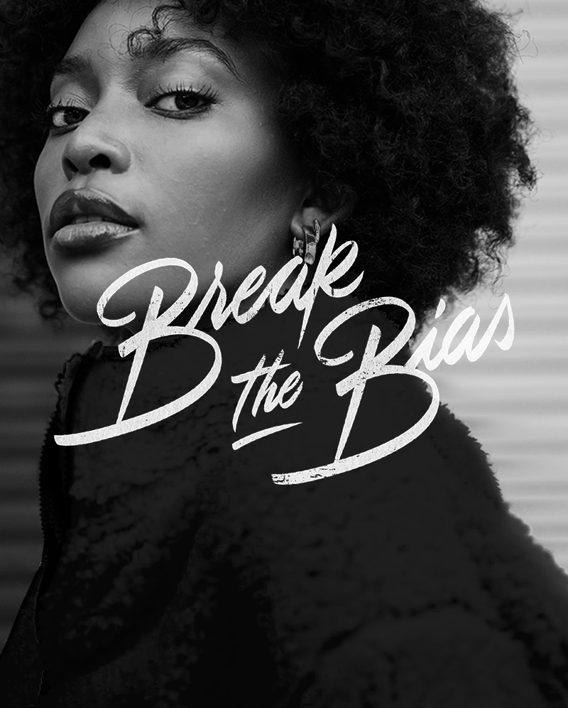
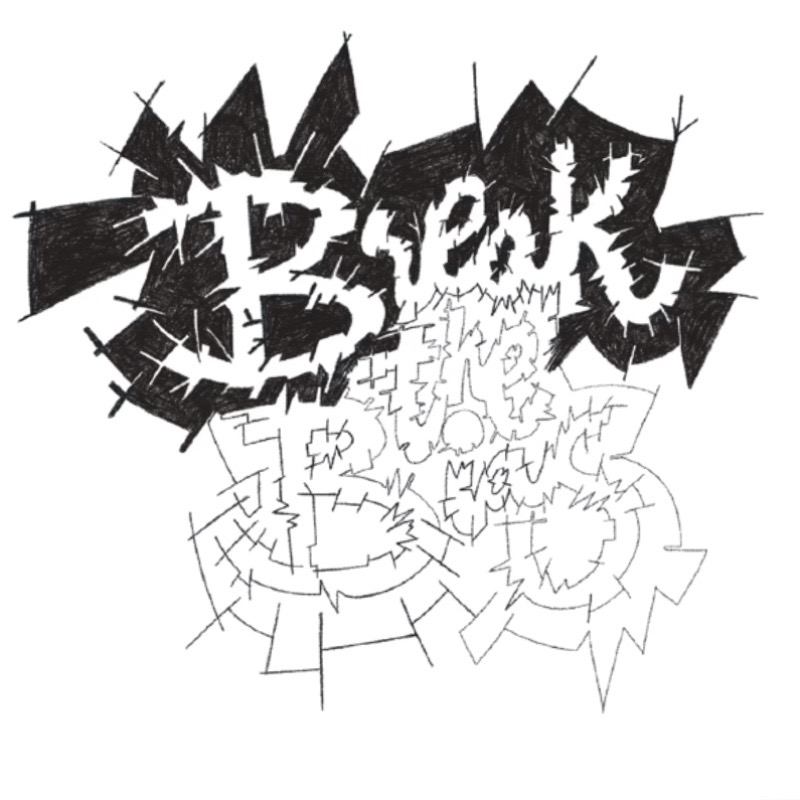
Hema Vyas | @typeshorty

I suppose I took the word ‘break’ literally and used that as a starting point to develop my idea. I wanted my type to incorporate a breaking element. I used a broken glass window as a reference point.
As mentioned earlier I used the word ‘break’ as my starting point in generating ideas. I then brainstormed different objects that might look interesting as broken. For example, broken mirrors, glass, biscuits, and a sheet of paper that’s been punched through. 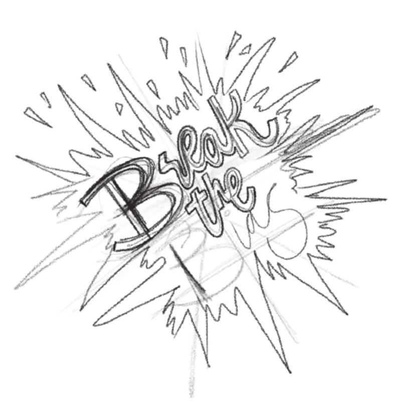
From that, I quickly drew a very rough pencil doodle of possible ideas on paper.
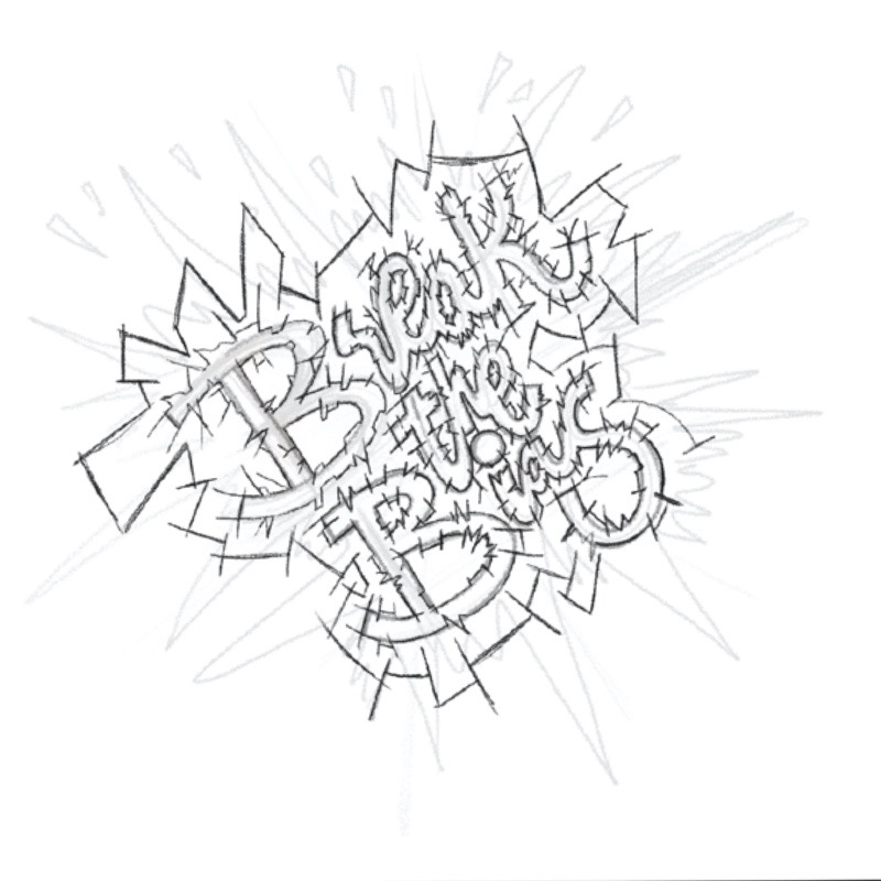
I also made a super quick single-line drawing of word placement.
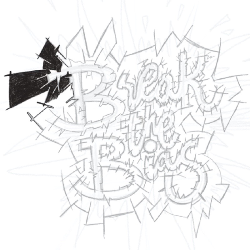
From that, I went into Procreate and sketched out a very rough idea and built up layers of sketching till I was happy with a form. And then pretty much traced over the rough sketches and filled in the piece using the pencil brush.

I suppose in some way I am someone who is breaking the bias as my appearance is what someone might say as androgynous, tomboy vibes.
I work in a school where children get to see a different type of woman and I hope that any child that doesn’t fit the conventional female type can remember me as that teaching assistant that was different but cool and female.
Like I mentioned before, I work in a school with quite a lot of female staff and I am amongst some powerful strong women that are making a huge difference in the lives of children, their education, and well-being!
International women’s day is celebrating women from the past, now and everyday women that we get to see every day!
(My mum and sisters)
A day where we can reflect on some of the steps they have taken to create a better life for themselves and others around them.
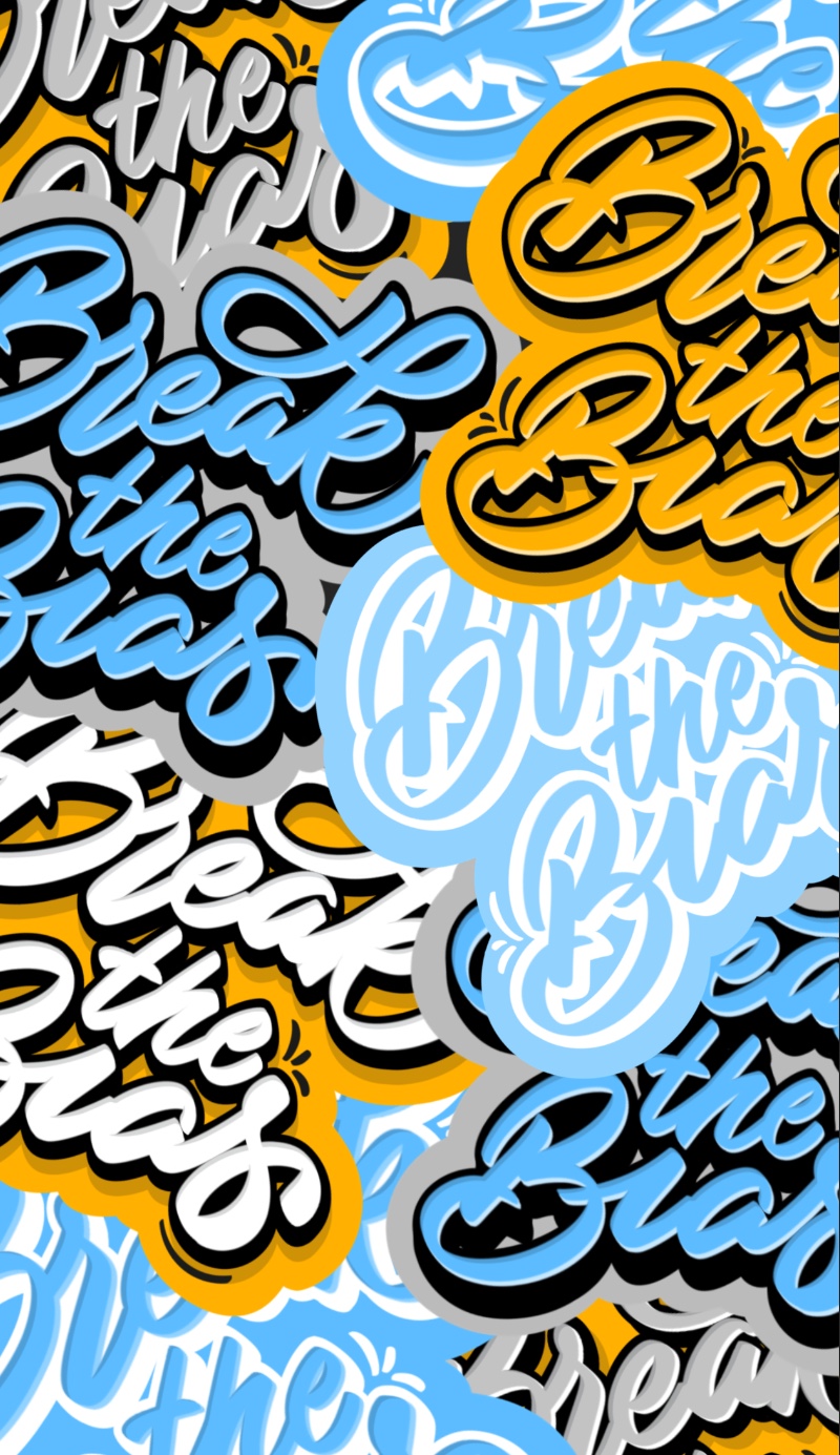
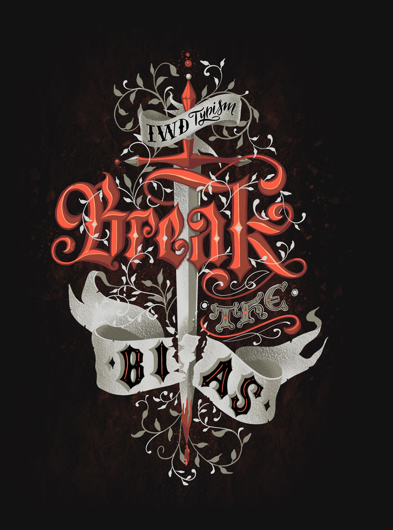
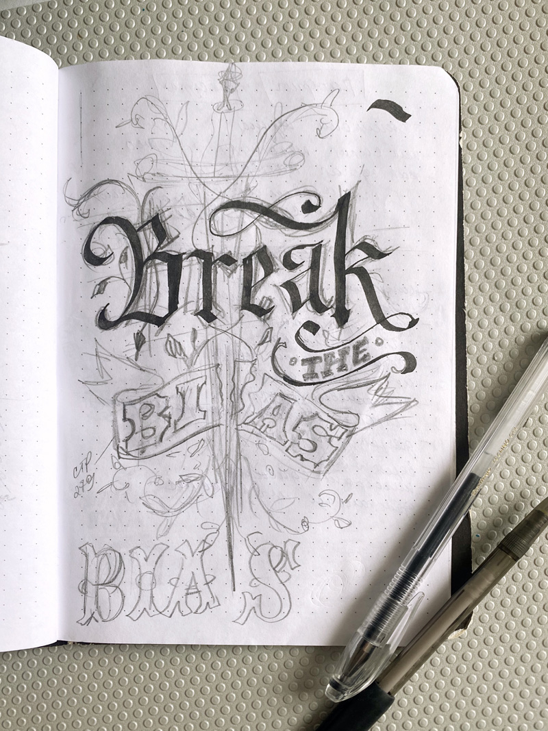
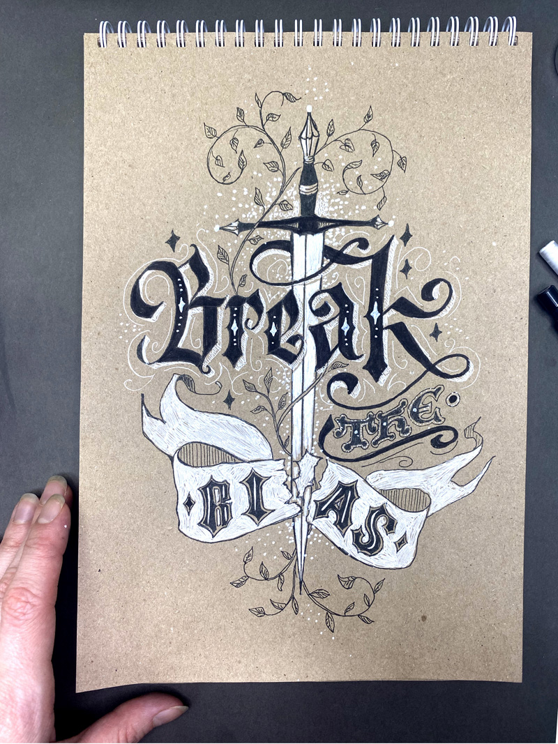
Natalya Tatar | @hoggi.art
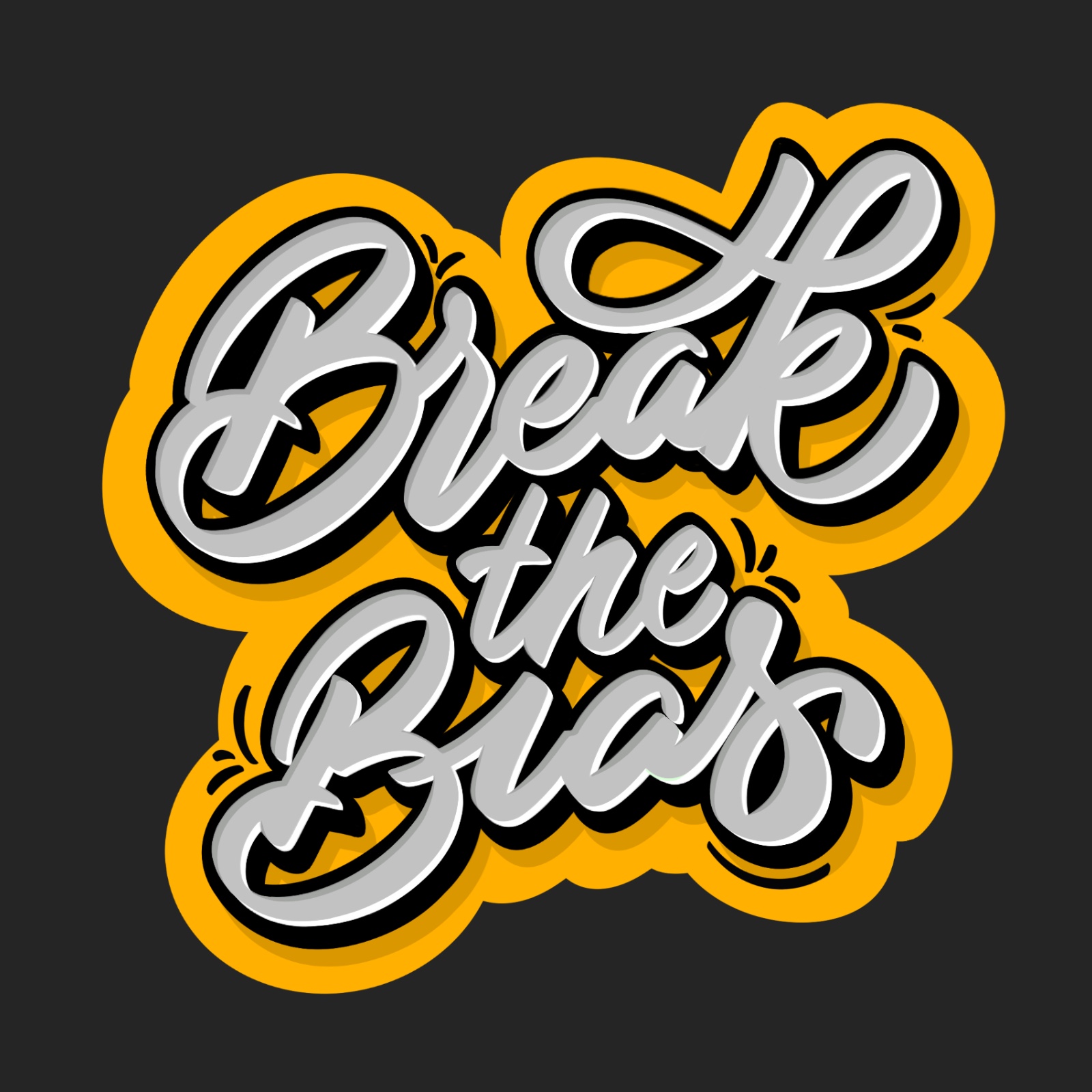
What is the concept behind your design?
In my design, I wanted to use a style that would emphasize the changes of modern reality, as well as the courage and confidence that are necessary to overcome prejudice. Therefore, lettering is built from a clear rhythm and forms.
What was your process for creating the artwork?
I always start my work on lettering with paper. I have been using an iPad for about two years, but the first sketches, searching for ligatures, and idle compositions are easier for me to do on paper. Then I draw everything on the iPad.

Do you have any views or comments about gender issues relating to the world of “women and typography”?
It may not be so noticeable in the creative environment, but it seems to me that in typography, as well as in almost any other professional field of activity, there is still a gender imbalance in the environment of pin designers in favor of men. Although every year more and more women designers appear
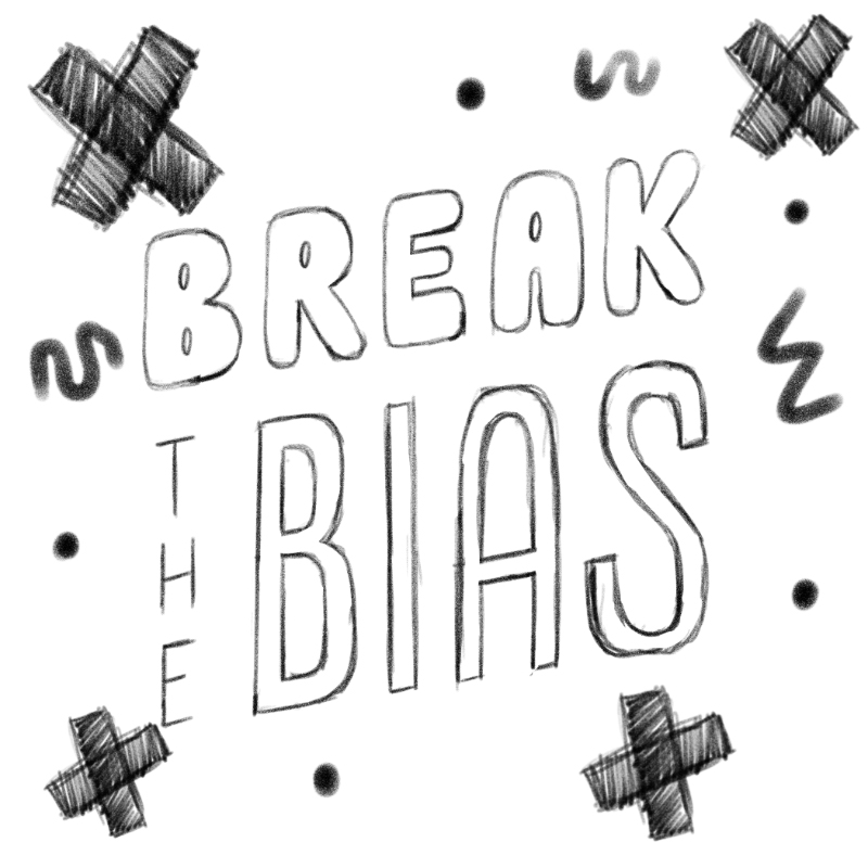
Alanna Flowers | @alanna_flowers
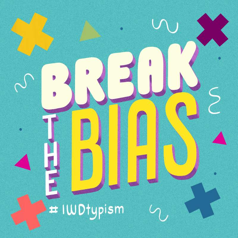
What is the concept behind your design?
My concept for this piece was to symbolize the movement to “cross out” the gender bias as we strive towards a more diverse and equitable world. That’s where using the X’s around the lettering came from. I also decided to create the lettering in a mix of styles to symbolize the need for increased diversity and representation.
What was your process for creating the artwork?
My process for creating this artwork started with going to the internationalwomensday.com site to learn more about the Break the Bias movement. After a bit of research, I played with the idea of mixing lettering styles and finished everything off with a color palette meant to explore the idea of feminine, masculine, and gender-neutral colors.

What does it mean to you to Break the Bias?
To me, it means first understanding that all sorts of biases exist and that we need to acknowledge them. From there we can identify ways that we can address and check those biases in the spaces that we occupy whether that’s at work, in our organizations, etc. With more awareness and education, we can break these biases and seek more diversity, equity, and inclusion.
What does International Women’s Day mean to you?
International Women’s Day to me means celebrating the women of the past, present, and future while also reflecting on the challenges we still face. The wage gap and lack of representation across a number of industries just to name some of those challenges.
Do you have any views or comments about any gender issues relating to the world of 'women and typography'?
There is always room for more women in the world of typography because we are still underrepresented in a number of creative industries. I believe this is even more prevalent in more niche industries like type design and lettering. This is why I love organizations like Femme Type that highlight the work of women in the fields of type design and lettering across their numerous platforms.
Maria Frolova | @letter_elfa
For me, it means the freedom of choice despite all the biases. As a girl I want to do what I want be it driving, fixing furniture, or sword fencing. I will choose what I like even if it is considered to be "men's occupation".
We will continue to share our favourite submissions to social media as they come in through the month of March, so please, continue to tag #IWDtypism on Instagram.
Thank you to everyone who participated this year.
Stay connected with news and updates!
Join our mailing list for the latest updates about Typism Summits, Books, Membership News, and the Latest Lettering Challenges.
We hate SPAM. We will never sell your information, for any reason.