The Top 10 System Fonts
Jan 06, 2023
Typography is an essential element of design that plays a crucial role in communicating written language.
Unfortunately, many of us work on computers where we have no control over what fonts are loaded onto the machine, so we have created a list of the top 10 most common system fonts everyone should know and how to handle them.
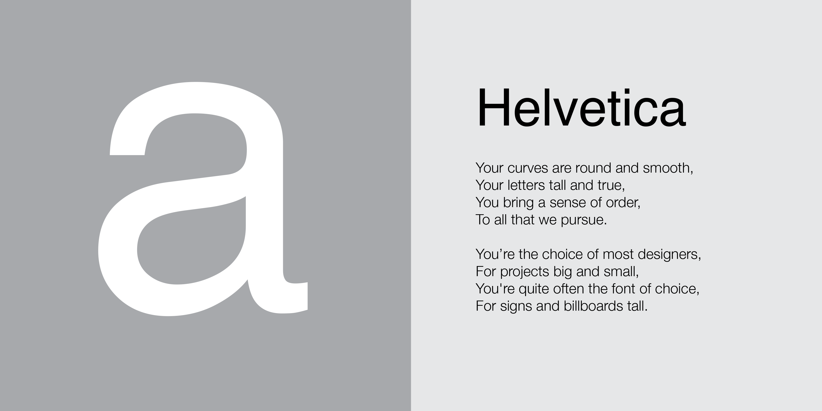
1. Helvetica
Helvetica is a widely used sans-serif typeface initially designed in 1957 by Swiss designer Max Miedinger. It is known for its clean, modern, and minimal design and has become one of the world's most popular and widely used typefaces.
Helvetica is often described as a neutral and versatile typeface that works well in various contexts and applications. It has a simple, geometric design with uniform stroke weights and is considered highly legible and easy to read.
Since its release, Helvetica has become one of the most widely used typefaces in the world and has been used in an extensive range of applications, including corporate branding and all the signage in New York. Unfortunately, for this reason, it can sometimes be deemed bland and invisible.
Do use: as your email font.
Don't use: in a logo design.
2. Futura
Futura is a sans-serif typeface designed in 1927 by German typeface designer Paul Renner. It is known for its clean, modern, and geometric design and has become one of the world's most popular and widely used typefaces.
Futura is characterised by its simple and geometric forms, as well as its uniform stroke weights and circular forms. It has a strong and modernist aesthetic and is sometimes associated with the Bauhaus design movement.
Since its release, Futura has become one of the most widely used typefaces in the world and has been used in a wide range of applications, including corporate branding, marketing materials, and user interfaces. As a result, it has become a symbol of retro modernity and simplicity in design.

Do use: if you want a "modern" font that rarely looks dated.
Don't use: if you want actually to appear "modern" as in, current.
3. Garamond
Garamond is a group of typefaces named after the French printer and type designer Claude Garamond (c. 1480–1561). Garamond was one of the leading type designers of the 16th century, and his designs have had a significant influence on the development of printing and typography.
Garamond's typefaces are known for their elegance and readability, with a strong emphasis on legibility and clarity. They are characterised by their small x-height, long ascenders and descenders, and moderate stroke contrast, which gives them a refined and formal appearance.
One of the most famous Garamond typefaces is the "Old Style" Garamond, initially designed by Garamond in the 16th century. This typeface is considered one of the most legible and readable typefaces in the world, and it has been used extensively in printing and publishing for centuries.
Other notable Garamond typefaces include the "Modern" Garamond, designed in the 18th century by Jean Jannon, and the "Cloister" Garamond, which Morris Fuller Benton designed in the 20th century.
In addition to their use in print, Garamond typefaces are also widely used in digital media, such as websites and electronic documents. Furthermore, due to its refined and professional appearance, Garamond is often used in formal settings, such as business documents and academic papers.

Do use: if you are designing the pages of a novel.
Don't use: if you want actually to appear "modern" as in, current.
4. Times
Times New Roman is a serif typeface designed by Stanley Morison and Victor Lardent in 1931. It was commissioned by the British newspaper The Times, which wanted a new typeface to replace its existing font, Times Old Roman.
The new typeface was designed to be more legible and easier to read than its predecessor, and it quickly became popular with newspapers and publishers worldwide.
Times New Roman is characterised by its small x-height, long ascenders and descenders, and moderate stroke contrast. It has a classic and formal appearance and is often used in formal settings such as business documents and academic papers.
Times New Roman has undergone several updates and revisions over the years and is a staple of the printing and publishing industry. However, it has a stuffy old appearance and is best suited for the purpose it was initially designed for—condensed columns of type in newspapers.

Do use: if you are designing for a newspaper or have narrow columns.
Don't use: if you are not designing a newspaper.
5. Arial
Arial is a sans-serif typeface designed by Robin Nicholas and Patricia Saunders in 1982. It was initially designed as a display font for IBM's new laser printer and intended to be a licence-free alternative to the popular but expensive font Helvetica.
Arial is characterised by its simple, clean lines and lack of decorative flourishes, just like Helvetica. It strongly emphasises legibility and readability and is often used for large blocks of text to be read on-screen.
In addition to its use in print, Arial is also widely used in digital media, such as websites and electronic documents. For example, it is a popular choice for use in PowerPoint presentations and other office documents because it is installed on every computer worldwide as a default font, and PowerPoint users are notoriously lazy.
Arial has undergone several updates and revisions over the years, and it is now available in several variations, including Arial Narrow and Arial Black. However, it is still only a poor imitation of Helvetica. If you have the option, replace all instances of Arial on your computer with Helvetica immediately.

Do use: if you don't have Helvetica and cannot install it.
Don't use: if you have Helvetica.
6. Verdana
Verdana is a humanist sans-serif typeface designed by rockstar Matthew Carter for Microsoft in 1996. Verdana was designed for computer screens and other low-resolution displays and was intended to be highly legible and easily read in small sizes. Humanist fonts are easier to read than traditional sans-serifs, and remember, in 1996, computer screens had terrible resolution.
Verdana is characterised by its large x-height, vast proportions, and open letterforms. It strongly emphasises legibility and readability and is often used for large blocks of text. It has a modern and clean appearance and is well-suited for use in digital media such as websites and electronic documents.
In addition to its use in digital media, Verdana is also used in print. However, it is not as common as other sans-serif typefaces, such as Arial or Helvetica, because people have no idea what they're doing, and the screen resolutions have improved since 1996. Nevertheless, it is still a popular choice for use on websites and other digital media because of its legibility and readability in small sizes.

Do use: if you are designing at teeny tiny point sizes.
Don't use: if you have plenty of room on your page.
7. Comic Sans
Comic Sans is a sans-serif typeface designed by Vincent Connare in 1994. It was initially designed for Microsoft Bob, a software interface designed to make computers more accessible and user-friendly for non-technical users.
Times New Roman was planned for speech bubbles in the program's (Bob) cartoon characters, but clearly, that was a bad idea (see above), so Vincent designed Comic Sans instead to have a more casual and friendly appearance.
Comic Sans is characterised by its informal and playful appearance, with rounded letters and moderate stroke contrast. It is often used for titles and headlines in documents and graphics and has a light and whimsical feel.
Despite its popularity, Comic Sans has also been the subject of much criticism and controversy. Many designers and typographers consider it poorly designed and overused, and it has been criticised for being inappropriate in many professional and formal settings.
Despite this, Comic Sans remains a popular typeface and is widely used in various contexts, including in documents, graphics, and digital media, again because it comes as a standard default font on computers, and most people are too lazy to look for something more suitable.
In addition, Comic Sans is often used in educational materials and children's products due to its playful and friendly appearance.

Do use: if you are designing a comic for 6-year-olds.
Don't use: if you want to be taken seriously by work colleagues.
8. Trebuchet
Trebuchet is a humanist sans-serif typeface also designed by Vincent Connare in 1996. It was initially designed for the Microsoft Windows operating system as a clean and legible typeface for on-screen applications and user interfaces. It also proves that Comic Sans wasn't a mistake, as Vincent can obviously design a decent typeface if he wants to.
Trebuchet is characterised by its simple and clean lines and a strong emphasis on legibility and readability. It has a friendly appearance and is often used for large blocks of text. It has a moderate stroke contrast and a large x-height, which makes it easy to read at small sizes.
Trebuchet has undergone several updates and revisions since 1996, and it is now available in several variations, including Trebuchet MS and Trebuchet Pro. It is a widely used and popular typeface and continues to be a staple of the digital media industry.

Do use: if you are designing a website.
Don't use: if you are designing for print and it isn't 1996.
9. Gill Sans
Gill Sans is a sans-serif typeface designed by Eric Gill in 1926. Gill was a British sculptor, type designer, and artist known for his contributions to printing and typography. His typefaces, including Gill Sans, are known for their classic simplicity, clean lines, and a strong emphasis on legibility and readability.
His diaries published in 1989, revealed Gill had a history of sexual abuse of his daughters, an incestuous relationship with at least one of his sisters, and even sexual experiments with his dog.
So, unfortunately, despite Gill Sans' beautiful, timeless design and its classic simplicity, I cannot bring myself to use it anymore. Therefore, it is essential to consider the personal histories of designers and take a stand against any form of abuse, no matter how long ago it happened.

Do use: if you can separate the man's deeds from his art.
Don't use: if you are creeped out by the whole dog and daughters thing.
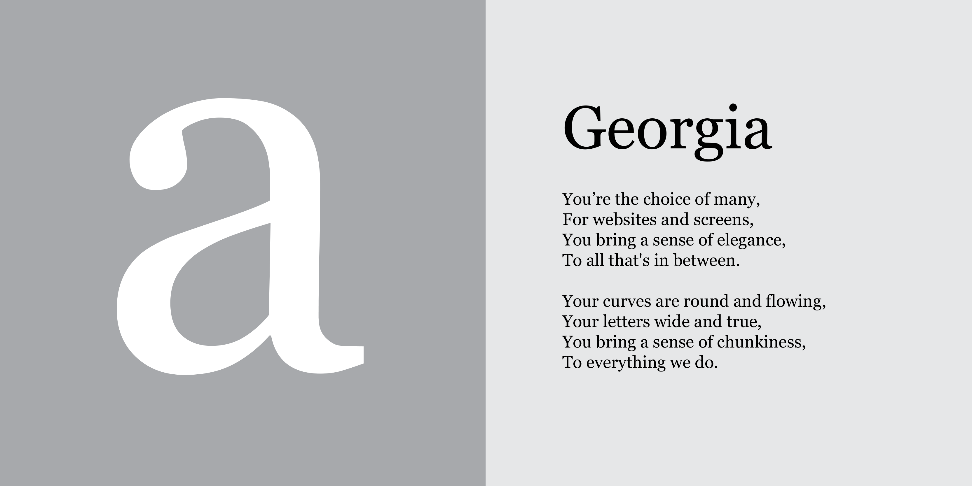
10. Georgia
Georgia is a serif typeface designed by rockstar Matthew Carter in 1993. It was specifically designed for use on the web and intended to be a highly legible and readable typeface at small sizes on computer screens.
Georgia is characterised by its large x-height, wide proportions, and open letterforms. It strongly emphasises legibility and readability and is often used for large blocks of text. It has a modern and clean appearance and is well-suited for use in digital media such as websites and electronic documents.
In addition to its use in digital media, Georgia is also used in print. It is a well-designed font, so even though it was designed for the screen, it prints nicely. However, it is relatively chunky and doesn't always play nice with others.
Do use: if you need a serif heading on your website.
Don't use: if you're also using a super light or clean font.
Stay connected with news and updates!
Join our mailing list for the latest updates about Typism Summits, Books, Membership News, and the Latest Lettering Challenges.
We hate SPAM. We will never sell your information, for any reason.